
So Long, Mom, I’m Off to Drop the Bomb: A Case Study in Public Usage of an Educational Tool
What the surprising popularity of a website suggests about our complicated relationship with nuclear weapons.
If a nuclear weapon went off in your hometown, what sort of damage would it cause? This question has been asked by millions of people since 1945 in both formal and informal settings. As an historian of the bomb, I’ve found that students in both high school and college remain fascinated—and horrified—by the subject. While images of distant mushroom clouds from Cold War nuclear testing films and photographs can still inspire awe, it can be easy to lose a sense of scale. Transposing nuclear weapons effects onto local maps has, since the early Cold War, been a method of communicating these kinds of concerns to lay individuals.[2] It was with this communication goal in mind that I created NUKEMAP in early February 2012.
NUKEMAP is a JavaScript “mash-up” of Google Maps with scaling equations for nuclear weapons effects, taken from former weapon systems analyst Carey Sublette’s “Nuclear Weapons FAQ.” NUKEMAP allows a user to enter an arbitrary location (it centers the map on the user’s general area by default, based on the internet protocol or IP address) and an arbitrary explosive yield. When the user clicks “Detonate,” circles appear on the map corresponding to the size of the fireball, the ranges of 20 psi and 4.6 psi overpressures (the former would destroy most buildings, the latter mostly residential buildings), acute radiation exposure at a 500 rem dose (which has between 50-90 percent mortality rates), and thermal radiation of sufficient energy to impart third-degree burns and start small fires (approximately 10 calories per cubic square meter). Qualitative descriptions for each circle accompany the visual image. This combination of multiple types of effects in one application is a unique feature of NUKEMAP compared to other web-based nuclear effects simulators.
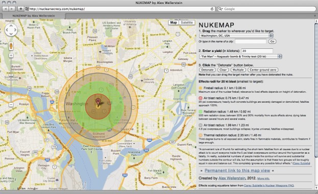
Users can drag a familiar Google Maps “marker” (slightly graphically modified) to an arbitrary point of detonation, or select a list of major world cities from a drop-down list. Also included in the list are the locations of specific nuclear detonations, including Hiroshima, or Bikini Atoll. Detonation yields can be expressed in an arbitrary number of kilotons (kt). A drop-down list also provides a dozen or so historical weapon yields, like the 20 kiloton atomic bomb tested near Alamogordo, New Mexico in July 1945, or the 10.4 megaton (Mt) thermonuclear device tested in 1952 at Enewetak Atoll. The effects equations are quite simplistic; they do not take into account terrain, blast height, building types, or fallout.
NUKEMAP Goes Viral
On February 13, 2012, NUKEMAP was picked up by media sources in the United Kingdom, and from there spread in waves to large numbers of “small” traffic sources (e.g. individual Facebook profiles and Twitter feeds), and then to “large” traffic sources and content aggregators (e.g., National Public Radio, io9, Reddit, CNET), and then back again to the “small” sources (e.g. blogs). At the height of coverage, the site received more than 100,000 unique visitors in one day, and even on “slow” days there were tens of thousands of visitors.
The NUKEMAP script tracks where users set off their “detonations,” and the size of the yield selected. (Users can choose to opt-out of this record keeping, and the script is honest.) The script does not record any personal information about users; in retrospect, I wish I had kept track of the originating country of users’ IP addresses, because without that I cannot tell with any confidence how many users were “nuking” their own countries versus foreign countries. NUKEMAP keeps track of user information through Google Analytics, which provides some information as to originating countries, but the large number of users and “detonations” makes any close correlation fruitless.[3]
Analyzing the Data
From February 3 through May 1, 843,860 unique visitors logged 4,328,729 “detonations” on NUKEMAP (the average of five “nukes” per visitor has stayed strong throughout the entire period). Given how the link circulated (and the fact that at the moment NUKEMAP is written only in English), it is not surprising that the top two countries are the United States (363,000 visits) and the United Kingdom (65,400).[4] After that, though, come Canada, China, Russia, France, Germany (between 44,800 to 56,000 visits each), Sweden (33,400), Spain (20,500) and Switzerland, Australia, and Finland (between 13,800 to 14,100 each). From there, all visits are less than 10,000 per country, though people from nearly ever country in the world have visited. Notably, from a nuclear perspective, Brazil had 8,300 visits, Israel 3,600 visits, India 2,900 visits, South Korea 2,000 visits, Japan 1,600 visits, Pakistan 276 visits, and Iran 44 visits.[5] (North Korea does not appear on the list, but its web traffic is reportedly routed through China.)

the near centers of the various continents (notably Africa and Australia) are
from users attempting to ascertain what yields would engulf entire continents.
As for countries targeted by the “detonations,” the numbers are only slightly different.[7] Some 41 percent of all “detonations” (1.8 million) were within the boundaries of the United States. This roughly equals the fact that 39 percent of all visits were from American IP addresses, and perhaps supports the conclusion that quite a lot of people were “nuking their own backyard,” as a number of commentators put it. The percentage of “detonations” of the United Kingdom, Canada, China, Russia, France, and Germany (between three to eight percent of the total) compares very closely with the percentage of total users from those countries as well (between six to seven percent of the total).[8]
There are some cases where the numbers are considerably different. While there were only 44 visits from Iran (less than 0.01 percent of the total), for example, there were some 29,800 “detonations” within its borders (0.7 percent of the total). Similarly, Japan made up only 0.2 percent of the visits, but 2.6 percent of all “detonations.” And while it appears no one from North Korea paid a visit, North Korea was the location of some 6,000 “detonations” (0.1 percent of the total). These differences are explained in part by the preset locations: Tehran, Tokyo, Hiroshima, and Nagasaki are “default” options that can be selected, and thus had a very good chance of being chosen by users. North Korea, however, is not a default option, so users have to specifically choose any “detonations” there.[9]
As for yields chosen, users display a marked preference for the very large. The preset list includes the 100 Mt theoretical design for the “Tsar Bomba,” a never-deployed or detonated weapon built by the Soviet Union in 1961. (The version actually tested on October 30, 1961 over Novaya Zemlya was, at 50 Mt, “only” half of the maximum size.) This by a considerable margin is the most selected “detonation” (19 percent of the total). Some 12 percent of the detonations chosen are even larger than the “Tsar Bomba”—created by users “playing” to see what the effects of arbitrarily large nuclear weapons would look like, or trying to determine what yields would be sufficient to destroy entire countries, continents, or even the planet. (The scaling effects in this case are highly unrealistic, of course.)
Interestingly, the next most common yields after those two categories are the .02 kt “Davy Crockett” device (the smallest yield and mass nuclear weapon ever produced in quantity by the United States; 7 percent of all detonations), and the 16 kt “Little Boy” uranium bomb dropped on Hiroshima (6 percent of all detonations). These are followed by the other choices on the preset list of varying sizes: the 50 Mt “Tsar Bomba” (6 percent), the 20 kt “Fat Man”/”Trinity” plutonium weapon (5 percent), the 1.2 Mt B83 (listed as the largest yield bomb in the current US stockpile; 5 percent), the 15 Mt “Castle Bravo” thermonuclear bomb tested in 1954 (4 percent) and 10 Mt “Ivy Mike” thermonuclear device tested in 1952 (4 percent). Further down on the list are the estimated 6 kt maximum yield of the second North Korean nuclear test in 2009 (3 percent), the 0.5 kt yield of the first North Korean test in 2006 (3 percent), and a hypothetical 10 kt “terrorist” nuclear device (2 percent)
These options can be divided into roughly three categories of interest: the largest yield weapons of the Cold War; possible weapons in a modern war (e.g. “terrorist” nukes, current US stockpile weapons, and North Korean weapons); and the historical weapons used at Hiroshima and Nagasaki. Interestingly, the weapons detonated by India and Pakistan in their respective 1998 test series have been less popular than any of the above mentioned, as are many other historical US warheads.
A number of users have commented that they thought the weapons were more powerful than they expected, while others said they were less powerful. The choice of the “Tsar Bomba” no doubt contributed to the former sentiment.
Conclusion
After reviewing the usage statistics, and many of the public blog, forum, and comments that have been published online regarding NUKEMAP, I have a few observations on the reception of the tool and its value as a pedagogical device.
First and foremost, it is clear that the users appreciated the ability to “nuke their neighbors,” as it was commonly put. The ability to easily situate the “ground zero” point at an arbitrary location, and to put in an arbitrary weapons yield, helped to personalize this tool (on the other hand, these features may have trivialized it for others). Many people refer to NUKEMAP as a “game,” which was not the intention (and there is no “gameplay,” strictly speaking). Many described using it as “fun,” which is not a term usually associated with targeting nuclear weapons and evaluating their effects. Still others, even when calling it “fun,” referred to it as “scary.” This fun/scary coupling is perhaps a novel way to approach the imparting of otherwise dry data about nuclear weapons.
The ability of users to make permanent links to specific yields and locations helped NUKEMAP get on the map, so to speak. Many people appear to have destroyed a specific location (e.g., London) and then posted the direct link to that for their online friends.
Including qualitative descriptions with the radii data (e.g. of blast or thermal damage) appears to have greatly increased the impact of the quantitative information. For this reason alone, including a wide range of effects seems in retrospect to have been a good idea: only covering blast or thermal damage reduces the number of vivid effects that can be described.
A blogger at the Washington Post suggested that the sudden popularity of the NUKEMAP might reflect present anxiety about Iran’s nuclear program and possible impending war.[10] This could be true—it is a hard claim to substantiate or refute—though I did not see much evidence for it in how the application was discussed in comments on the web at the time or since.
It is perhaps unsurprising that sacrificing technical accuracy in exchange for ease-of-use, ease-of-circulation, and user-freedom has led to NUKEMAP’s popularity, perhaps riding on the coattails of general topical nuclear interest. As its creator, I’d like to believe that some genuine education about nuclear weapons snuck in while people were “playing” with the bomb.
Alex Wellerstein is associate historian at the American Institute of Physics and the creator of “Restricted Data: The Nuclear Secrecy Blog.”
Notes
[1] The title of course refers to the first line of satirist Tom Lehrer’s 1965 song, “So Long, Mom (A Song for World War III).”
[2] I would be the first to acknowledge that there is a long history of using maps to convey the effects of nuclear weapons. The earliest version of a NUKEMAP-like apparatus that I have found dates from 1950, and featured an acetate sheet that one could overlay onto maps at the correct scale to simulate 20 kiloton detonations. There have been other websites that have done similar mash-ups as well, but none with quite the range of effects as the NUKEMAP.
[3] This lack of precision in tracking was somewhat intentional. Nuclear weapons topics still make lay people very uncomfortable, and many already harbor strong suspicions that any searches or activities of this sort online are tracked. (A number of bloggers speculated that I myself might be whisked away to a “black” site for interrogation; needless to say, this has not occurred.) I also have a strong belief in the privacy of my users. Still, if I had known the site would be so popular, I could have built some kind of reverse-geocoding into its operation, and just culled aggregate country data from the IP address, without storing the IP address itself.
[4] When looking at countries, Google Analytics only provides data on “visits” as opposed to the more useful “visitors.” So there may be some double counting here.
[5] All country-specific numbers except the last two have been rounded to the nearest hundred.
[6] Attempts to generate similar visualizations for numbers significantly greater than one million proved too much for the Google Maps application.
[7] In cases where there was any uncertainty, determining which detonations occurred in which country was only roughly approximated.
[8] One anomaly is that Sweden makes up six percent of the detonations but only four percent of the visits; this is likely because a popular Swedish blogger took the time to render a very detailed, multiple-nuke attack plan with some 40 detonations on it, thus multiplying the number of detonations for each of those users considerably.
[9] I did not make any North Korean cities targets not because I don’t believe that they aren’t likely potential targets, but because the choice of preset cities was made from the point of view of where I thought NUKEMAP users might live. I did not anticipate sufficient numbers of North Korean users to warrant making it a default, and did not think that bombing North Korean cities would provide much educational value, since so few people have actually visited any North Korean cities.
[10] Elizabeth Flock, “Iran nuclear talks failure sparks fears online,” Washington Post, February 23, 2012.